![]()
![]() Our logo is not just an ordinary sign. There is a metaphorical tale to it. Each colour and element has a unique meaning that enriches the message that we wish to convey. However, artistically, they all merge in order to point to the values our school is proud of – how important education really is.
Our logo is not just an ordinary sign. There is a metaphorical tale to it. Each colour and element has a unique meaning that enriches the message that we wish to convey. However, artistically, they all merge in order to point to the values our school is proud of – how important education really is.
THE EAGLE
 The bird in the logo is an eagle. Its white wings and courageous flight represent youth, while its strength and dignity portray a young person in search of knowledge. The eagle also symbolises respect, strength, elevation, spirituality and liberation from all earthy shackles. Endowed with an impeccable sense of vision, an eagle has always been a kind of visionary that announces change and encourages creativity. The eagle is therefore considered to be a symbol of social and spiritual rising, and the connection with the sky gives him enormous power and keeps it in the heights.
An eagle is a bird of rulers, a celestial equivalent to the lion on Earth. Almost all nations respect it. In Slavic mythology, it is considered a divine bird, associated with supreme deities, rulers, noblemen and warriors. In Greek mythology, the eagle is the bird of Zeus, which is why it is often associated with the source and meaning of light. According to a myth, eagles, which are said to have begun a flight from the end of the world, met on the top of the omphalos at Delphi, where they remained perching and following the Sun’s path from dusk till dawn. According to yet another legend, an eagle possesses the power of rejuvenation. It boldly flies towards the Sun, and once its feathers start burning with the scorching heat, it dives back into the water and emerges rejuvenated.
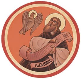 As a bird of enlightenment, in Christianity, the eagle is identified with St. John the Theologian, Christ’s youngest and most faithful disciple, a witness to all of his earthly wonders and a devoted follower of His religion after the ascension. As a symbol of intellectual strength and commitment, St. John the Theologian is a patron saint of Savremena International School. He is symbolically represented as a flying eagle in our logo.
THE HORIZON
 The elements which combine into a modified semi-circle represent a horizon. Over the blues seas, green valleys and red mountains, our eagle flies courageously towards the Sun. Nevertheless, this is a metaphor… In life, people come across many challenges, which is why we should use our wisdom to learn how to cope with them. Only when we are able to transform our fear of challenges into the courage to face them, are we able to get over them. School, which is part of our students’ lives, is a horizon indeed, where the challenges might be a tough lesson, bad mark, argument with the best friend or disappointment with love. But our school supports our students so that there isn’t a challenge unabridged with a solution. Only then will the eagles fly again.
THE COLOURS
According to heraldic principles, each colour that appears in our logo has a meaning, and the features are those of our students:
- WHITE is a heraldic colour which represents youth and beauty. The white eagle in the logo symbolises our students, who grow from an eagle chick to a mighty bird, ready to majestically and boldly fly towards the new academic challenges.
- YELLOW is a colour of generosity and goodness, which are the virtues we would like to foster in our students’ social relations, not only within the school but also outside the school. This is the very reason why we encourage social responsibility among our students and support volunteering in various extra-curricular activities.
- RED as courage and determination. At our school being courageous and determined means recognising one’s potential, which, with the support of the teachers and the family, can bring about excellence in learning and academic success.
- GREEN symbolises hope and joy. We see it in the smiles of our students and teachers, who have the power to move mountains.
- BLUE is the colour of loyalty and truth. In our school, encouraging students to embrace these values is very important to us because they will only make them better people.
SCHOOL YEARS
Finally, each colour in our logo represents the path which our students trod from the first to the fourth year, growing from a high-school students to a university student.
Year 1 – BLUE – Endless and turbulent like the sea
Year 2 – GREEN – Stable and safe like a take-off zone
Year 3 – RED – Dizzy and busy like flying up the high mountains
Year 4 – YELLOW – Inspiring and aspirating like a bold flight towards the Sun
LOGO AS OUR IDENTITY
Our logo is represented on all the items in our souvenir programme, office stationery, school stationery as well as on our school uniform – T-shirts, jackets, caps, etc.
Savremena International School has designed a special uniform for its students in order to promote its ethos and inspire a sense of loyalty and belonging amongst its students. By wearing these, our students will have an opportunity to show how proud they are of their school.

Enrolment for class 2026/27 is underway!
Click here to register »


